
Logo types: wordmarks, lettermarks, emblems, mascots and more
Most logos fall into one of seven types. The type you choose decides how your logo behaves in daily use: whether people can read your name in it, whether it still works as a tiny app icon, and whether it survives being stitched onto a cap. This guide lists the seven types first, then explains each one with examples from our homepage gallery, and ends with questions that make the choice easier.
By AI Logo Generator · Updated
What are the main types of logos?
There are seven main types of logo: wordmarks, lettermarks, pictorial marks, abstract marks, mascots, emblems and combination marks. They differ in whether they show your name, your initials, a symbol or a character, and the type you choose decides how well your logo works at small sizes and on products.
- Wordmark: your business name in a distinctive typeface.
- Lettermark or monogram: your initials.
- Pictorial mark: a recognisable object, such as a leaf or an owl.
- Abstract mark: a shape that doesn't depict a real object.
- Mascot: a character that represents the brand.
- Emblem or badge: your name inside a shape, such as a circle or a crest.
- Combination mark: a symbol and your name together.
What is a wordmark logo?
A wordmark is the business name set in a distinctive typeface, with no symbol. It works best when the name is short and easy to remember, because the lettering carries the whole identity. Wordmarks look good in wide spaces such as a website header, a shop sign or an email signature.
The weak spot is square spaces. A long name squeezed into a social media avatar or an app icon becomes unreadable, so most wordmark brands also keep a square version, often just the first letter.
Example prompt: wordmark logo for a coffee roaster called Harbor and Pine, serif lettering, dark brown on cream, no icon
What is a lettermark or monogram logo?
A lettermark uses initials instead of the full name. It suits long names and brands that want to look formal or premium, which is why it is common in fashion, law and consulting. The Noble Rain example below combines an NR monogram with the name underneath.
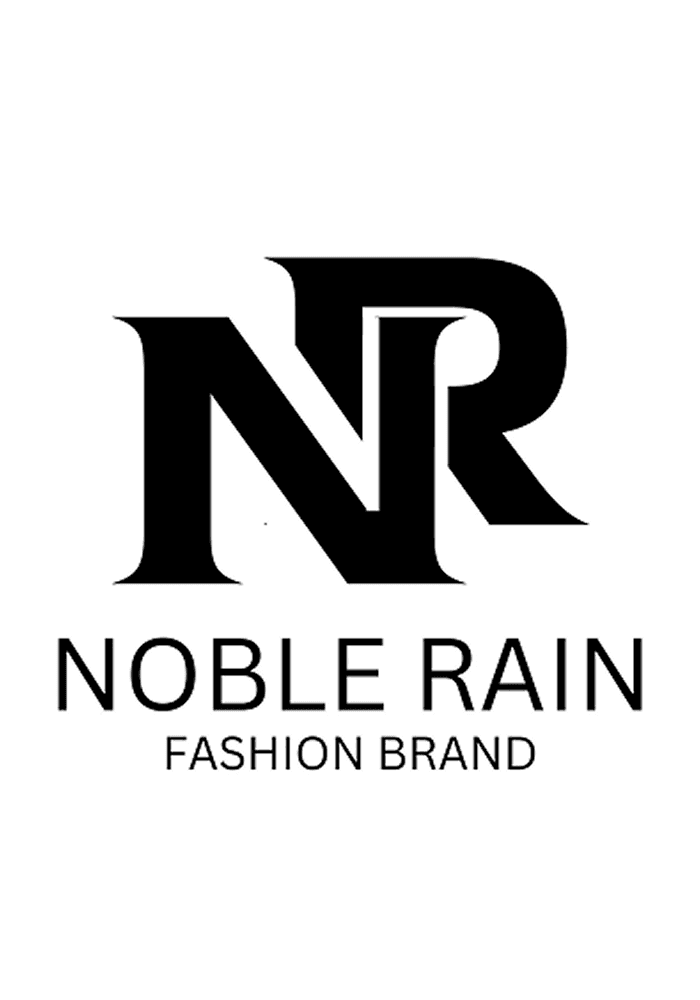
Initials mean little until people know the brand. If you are just starting, show the full name next to the monogram for the first months.
Example prompt: monogram logo with the letters NR for a fashion label, black, high contrast, elegant serif
What is a pictorial mark?
A pictorial mark is a recognisable object, such as a leaf, an owl or a coffee cup. It works when the object says something true about the business and stays clear at small sizes. Simple outlines read better than detailed drawings.
Very common objects, such as a light bulb for an ideas company, look like hundreds of other logos, so check for similar marks before you rely on one.
Example prompt: pictorial logo of a single green leaf inside a water drop for an eco cleaning brand, flat, two colours
What is an abstract logo mark?
An abstract mark is a shape that doesn't depict a real object, such as interlocking lines or a stylised letter. It gives you a distinctive symbol that can grow with the business, which is why technology companies like it. The catch is that the shape has no meaning at first: people learn what it stands for from seeing it next to your name.
Example prompt: abstract geometric logo mark for a software company, two overlapping shapes, blue gradient, modern
What is a mascot logo?
A mascot logo is built around a character. It gives a brand a face, which works well for food, sports and esports teams, and anything sold on merchandise. The tiger on the Burger logo, the barista on Velmora Coffee and the dragon on Dragon Steel are all mascots.
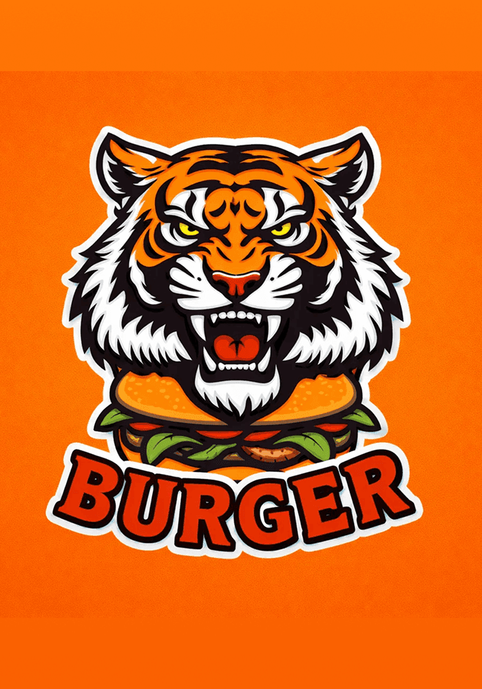
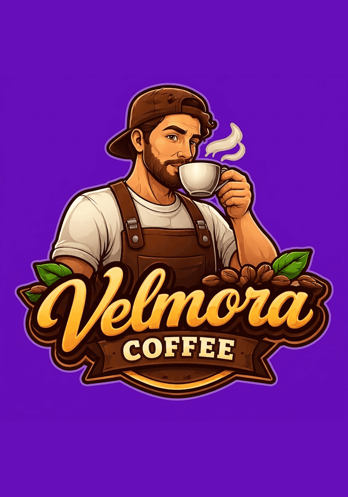
Mascots carry a lot of detail, and detail disappears when a logo gets small. Plan a simpler version, often just the head, for favicons, profile pictures and embroidery.
Example prompt: mascot logo of a friendly fox chef holding a spoon for a family restaurant, bold outlines, warm colours
What is an emblem or badge logo?
An emblem puts the name inside a shape: a circle, a shield, a crest. It feels established and is popular with cafés, clubs, breweries and anything with a vintage look. The Fauget and Riders Club logos below are both emblems.
Small text inside a badge is the usual problem. On a stamp, a cap or a favicon, the lettering blurs into the shape. Keep the words few and large, or make a simplified version.
Example prompt: vintage round badge logo for a surf shop called Saltline, wave in the centre, name around the edge, two colours
What is a combination mark?
A combination mark puts a symbol and the name together. It is the most flexible type: you can use both side by side on a website, stack them for a square space, or use the symbol alone once people know it. The Urban Ride Cleaners logo combines a car and a splash with the name.
Example prompt: combination logo for a bike repair shop called Spoke and Chain, simple gear icon left of the name, dark green
How do I choose the right type of logo?
Start with your name and where people will see your logo most. A short, distinctive name can stand alone as a wordmark, while a long or generic one needs a symbol or initials. If most people will meet your brand as an app icon or a profile picture, choose a design with a strong square symbol. These four questions settle it:
How long and distinctive is your name?
A short, unusual name can carry a wordmark on its own. A long or generic name usually needs a symbol (a combination mark) or initials (a lettermark).
Where will people see it most?
If most people will meet your brand as an app icon or a profile picture, you need a strong square symbol or lettermark. If it will mostly sit in a website header or on a shop front, a wordmark or a horizontal combination mark fits better. Our guide to logo sizes for websites, social media and print lists the shapes each place needs.
Will it be printed, stitched or stamped?
Embroidery, rubber stamps and small stickers punish fine lines and small text. Pictorial marks, lettermarks and simple combination marks hold up better than detailed emblems and mascots.
Does it work in one colour?
Whatever the type, check the logo in black only. If it still reads, it will work on invoices, stamps and single-colour printing.
How can I try different logo types with AI Logo Generator?
With AI Logo Generator each request gives you one design, so the quickest way to choose is to ask for the same name in two or three types and compare them side by side at full size and at icon size. If you already have a logo and want a different type, you can upload it and redesign it instead of starting from scratch.
Frequently asked questions
What is the difference between a logomark and a logotype?
A logotype is text: your business name or initials set in a particular typeface, like a wordmark or a lettermark. A logomark is a symbol without words, such as a pictorial or abstract mark. Put the two together and you have a combination mark.
Which type of logo is best for a small business?
There is no single best type, but a combination mark is the safest choice for most new small businesses: it shows your name while people get to know you, and the symbol can later work on its own. If your name is short and distinctive, a wordmark is simpler and works just as well.
Should my logo include my business name?
In most cases, yes, at least while people are getting to know you, because a symbol alone means nothing to someone who has never seen it. Keep a version without the name for small square spaces such as app icons and favicons, and use it on its own once your symbol is familiar.
Can I change my logo type later?
Yes. Many brands start with a combination mark and later drop the name or simplify the symbol as they become better known. Keep the same colours and main shape so customers still recognise you. With AI Logo Redesign you can upload your current logo and describe the new layout you want.
Make your logo with AI Logo Generator
Describe your business or upload the logo you have, then edit the design and download it as PNG, SVG or PDF.
You can try it for free: new accounts get free credits to create logos. Logos you download without a plan have a watermark, and buying a plan removes it.